Exponential Growth and Depletion: Chart of the Century?
by Charles Hugh Smith
The chart displays two lines: the blue line traces out exponential growth (for example, in demand for oil, deficit spending, etc.) while the lower lines traces out exponential depletion (for example, of oil reserves). The consequences of a "modest" 3% growth/depletion rate are striking and sobering.
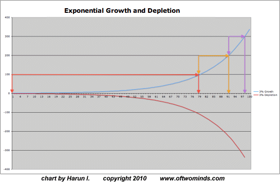
Here is Harun's accompanying commentary.
In the ongoing effort to help people understand what exponential or compound growth (and depletion) mean, I have prepared the following chart.The chart depicts 3-percent growth and depletion. It does not matter what is measured, whether it is energy, debt, land, or population, the effects are the same and they are important to understand.
Time is not your friend and why the Red Queen’s Race cannot be won:
The arrows indicate how long it took to obtain an incremental level (100).
What does this mean? Considering debt growth, the current monetary system requires positive debt growth or the dreaded deflation will occur. As you can see to achieve the first increment of 100 took nearly 80 periods. The second period to achieve the next increment took about 11 periods and the third just over five.
The harsh reality demonstrated here is that it is not a matter of if the physical economy will be able to support such debt growth but only a matter of when it implodes. Remember, the inverse curve represents the necessary decline in savings or the ability to save. At the point that the government is giving away money, why should anyone work? Bailing out neither banks nor sovereign states can save the status quo.
This principle applies in terms of crude oil usage. It is most damaging to the arguments that we just need to find another giant field. It is also why Hubbert was absolutely correct in his assessment. The time to deplete an oil field the size of the one in Saudia Arabia decrements as seen here (if demand remained constant). With no new major finds and most fields mature or declining we are already too far behind the curve to prevent shortages.
I think (hope) with these examples you get the idea: We are on a collision course with reality.
In an email exchange, I noted that giving Greece more bailout money did nothing to change Greece's inability to make the payments due on their current debt, much less additional debt. I also noted the impact of Jevon's paradox on oil consumption; the paradox is that "technological progress that increases the efficiency with which a resource is used, tends to increase (rather than decrease) the rate of consumption of that resource." Harun responded thusly:
Your thought about Greece is an excellent point and was one of the reasons I produced the chart. Greece's physical economy cannot support its financial economy. This is the end game in the "debt as money-post industrial" economy for all OECD countries. California is another good example of the effects of compression. If we were to look at the growth rate (inflation) as necessary to maintain a constant standard then the problem for the physical economy is apparent. In reality it is not a "problem", it is an impossibility.
If we were to look at the first 80 periods as years then growth was considered strong and the reliance on inflation not really a concern. But then in order to maintain status quo the same amount of credit expansion had to be created in just about 11 years, then 5. Can products and services grow at this rate? Advances in technology, CDO/CDS have prolonged the endgame and made some people very wealthy but the leverage is way beyond what the physical economy can ever hope to service let alone repay.
I think the chart also emphasizes the problem with China. Unless something changes, this chart reveals that energy will be a huge obstacle to growth in China. What is thought of as the China Phenomenon will likely turn into the China Syndrome redux.
For arguments sake, if we were to say that there was one large oil field, it was used up in 80 years. Then we found another and with demand constant, even devoid of increases in technology, we used the second field (which was the same size as the first) in about 11 years. Then we got lucky and found another field of the same exact size as the rest but with demand growing at a constant 3 percent, we used it up in about 5 years. Regardless of how many energy deals China manages to finagle, the situation, short of a miracle, is hopeless.
And, as predicted in the exponential model instability is also occurring with greater frequency.
Finally, along the lines of Jevon's paradox, and, If you give a mouse a cookie... bringing jobs back to the US will not necessarily solve more comprehensive issues as the resource economy would not be able to support the physical economy.
Thank you, Harun, for this deeply insightful chart and commentary. In my view this is "the chart of the century."
| Thank you, Bill S. ($40), for your exceptionally generous contribution to the site. I am greatly honored by your support and readership. | Thank you, Barney S. ($10), for your ongoing, monumentally generous donations to the site. I am greatly honored by your support and readership. |


