Risk, Feedback and the Market's Next Move
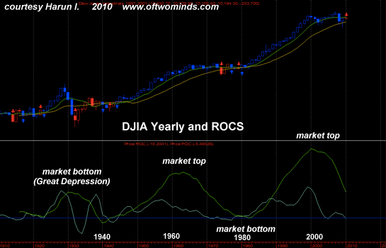
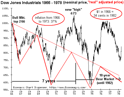
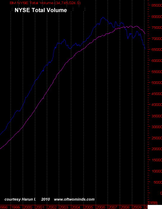
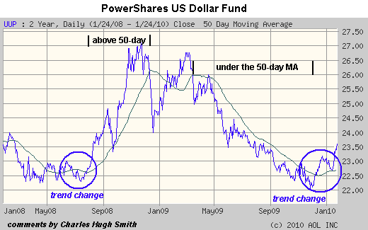
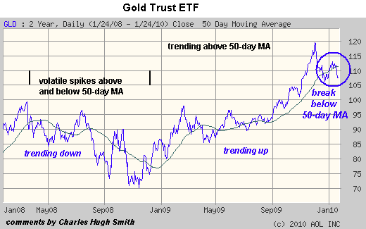
Risk has returned to global markets as participants grasp that the central banks' quantitative easing and massive stimulus have failed to reset the clock to 2006. Right now there is a forecast for every possible market move. The dollar is about to turn down and gold is about to race higher; or, gold is about to fall to $700/ounce. The global markets are about to embark on a crushing Wave 3 decline to new lows, or the lows of 2009 will not be revisited in our lifetime. And so on. Nobody knows what's going to happen. If it were easy to predict the market's gyrations, we'd all be millionaires. But rather than rely on dart throws, we can construct a context based on "first principles," which in the Survival+ analysis consist of an integrated understanding of context, causal connections and feedback loops. Thus we can start by stating that the governments' collective efforts to reset the global economy to bubbly 2006 with quantitative easing and massive stimulus have failed, and the global markets are pausing now in recognition of this forward uncertainty. Yes, profits have skyrocketed from the depths of 2008 as corporations have slashed headcount and spending, but you can't squeeze endlessly rising profits by harvesting the low-hanging fruit of cost-cutting; that's essentially a one-off that's already been done globally. To grow profits from here, corporations need sales growth. Any growth dependent on government stimulus is suspect because at some point that stimulus will decline or cease. Hence the uncertainty and sudden appreciation of forward risks to the "endlessly rising profits from endlessly rising sales" story. In response to the visible failure of their QE/loose money/unprecedented stimulus giveaways, the central banks and their governments have announced more of the same. That is the primary feedback loop: lacking any political courage to tackle the endemic rot at the core of the global economy--excesive borrowing, leverage, bubble-blowing, etc.--then the governments keep pulling the one lever available to them which does not cause any immediate political or financial pain: more QE and more stimulus. The pain from relying on QE and stimulus--in effect, extricating ourselves from overindebtedness by piling on more public debt--will come later, and hence is politically acceptable. For context, let's consider a few charts. As always, please refresh your awareness that there is investment advice on the freely offered site, only the meanderings of an amateur observer (me) by reading the HUGE GIANT BIG FAT DISCLAIMER below. Any metric derived from price is called a derivative. Thus in calculating the rate of change (ROC) of price we have a first derivative, and if we further calculate the percentage of the ROC then we have a second derivative of price. This is known as quantititive analysis, a little-understood arm of technical analysis. Frequent contributor Harun I. submitted several long term charts, one of total NYSE volumes and another of the percentage rate of change (PROC) of the Dow Jones Industrial Average (DJIA). These metrics provide a "beneath the surface" view of the market on a long-term scale which in effect smoothes out not just daily gyrations but weekly and monthly movements as well. The PROC is a second derivative of the price. By plotting two second derivatives in slightly different time settings, we get a chart similar to MACD or stochastics, in which the two plotted lines crossing provide a signal. Here are Harun's comments on the charts. This assumes that the 100+ year bull market will continue. Note that both ROC's have spent very little time in negative territory. However, this pattern will not continue indefinitely. At some point there will be a crossover and a sustained period below the zero line. It is likely that these times will be extremely difficult. If history is any guide, I think this is a realistic view of what may lie ahead. Remember that it is a moving average of the ROC's so there is a lag. But as you can see the the 10-year SMA of the the 10-year ROC has been fairly accurate. The thing we should be concerned with most is an upswing at the end of this down-cycle that produces a new nominal high but a lower momentum peak creating a divergence. At this level of trend, such a divergence would be a very grave warning. If the game is not over yet, such an occurrence would probably mark a final blowoff and then things get really interesting for the next century or more. Some might find this hyperbolic. The very fact that very few think it can happen creates the vulnerability. The millennial cycle is not going to abate just because we say it isn't so. Please excuse the low resolution of this chart. I reformatted it to fit the screen. Interestingly, the notion that the market is a full decade away from a true bottom aligns with two other contexts: the Bear market of the 1970s lasted from 1966 to 1982, approximately 16 years in which "buy and hold" investors lost 2/3 of the value of their stock holdings even as nominal prices hovered around DJIA 1,000. (Inflation destroyed 2/3 of the purchasing power of their investments.) This projection to a market bottom in 2020-2022 also align with the generational forecast made by the authors of The Fourth Turning, which posits a 4-generation (80-year) cycle of major crises (and resolutions) in U.S. history: 1781 (birth of the nation), 1861 (Civil War), 1941 (Depression and world war) and hence 2021 (collapse of the Savior State and Plutocracy status quo, Peak Oil, etc.) The Wall Street Truism has it that "volume is the weapon of the Bull." If so, this chart reveals that the Bull has been in retreat since 2006, and that the recent global rally is entirely lacking in volume and thus conviction. Since many observers are obsessing over the direction of gold and its see-saw playmate, the U.S. dollar, I include two shorter-term charts. The UUP is a proxy for the USD and GLD is a proxy for gold. I have constructed the most basic technical system: price and the 50-day moving average. When price moves above the 50-day MA, that is a bullish trend; when it moves below, that is a bearish trend. The chart of UUP certainly suggests the downtrend in the dollar has reversed. The chart of GLD is more ambiguous--it could be "resting"/basing for its next leg up, or it could be topping out and about to roll over into a downtrend. Regardless, it is unambiguously bearish to be below the 50-day MA. What is also noteworthy is the extreme volatility in the price of gold. Guessing its next move is not for the faint of heart. No one knows what the market's next move will be--there are guesses for up, down and sideways. But a glance at these charts should make us skeptical of forecasts of a new long-term Bull market in equities. There will be no entries or responses to email Tuesday or Wednesday--my apologies. DailyJava.net is now open for aggregating our collective intelligence. Of Two Minds is now available via Kindle: Of Two Minds blog-KindleBelow you will find a study of the historical PROC (percent) of the DJIA (yearly). The light blue line is a 4 period SMA of a 4 period ROC. The light green line is a 10 period SMA of a 10 period ROC. The big picture here is that, while the 4 period ROC bottoms first the next cycle will not begin until the 10 period ROC bottoms, which looks like at least another decade off.(emphasis added, CHS)
If you haven't visited the forum, here's a place to start. Click on the link below and then select "new posts." You'll get to see what other oftwominds.com readers and contributors are discussing/sharing.
Order Survival+: Structuring Prosperity for Yourself and the Nation and/or Survival+ The Primer from your local bookseller or from amazon.com or in ebook and Kindle formats.A 20% discount is available from the publisher.Thank you, Bruce B. ($50), for your stunningly generous contribution to this site. I am greatly honored by your support and readership. Thank you, Jeff S. ($40), for your extremely generous contribution to this site. I am greatly honored by your support and readership.


