The Case for a Crash in 2014/2015
Looking past the year-end Santa rally to 2014....
With the 2013 Santa stock market rally in full euphoric swing, any discussion of a crash in 2014 strikes a note of cognitive dissonance. With the Fed promising to keep interest rates at zero until 2099 (or whatever date signifies "forever"), the prospects of ever-higher prices in every asset class never seemed brighter.
But the nagging question remains: if everything is so great, why does the Fed need to keep interest rates at zero forever?
As a result, there are two mutually exclusive forecasts floating around: that the Great Bull Market will run for years to come, so no worries; and that markets are exhibiting bubble-like characteristics that presage another crash.
So which forecast is more likely the correct one?
Analysts of every stripe—fundamental, quantitative and technical—pump out reams of data and charts to support one forecast or another, and economists (behavioral, macro, etc.) weigh in with their prognostications as well. All sorts of complexities are spun as a by-product of producing research that’s worth paying for, and it all becomes as clear as…mud.
As an experiment, let’s strip away as much of the complexity as possible and look at a few charts of what many observers see as the key components of the U.S. economy and stock market.
Let’s start with a basic chart of the S&P 500 (SPX), a broad measure of U.S. stocks:

Without getting fancy, we can discern three basic phases: what we might term “the old normal,” from the late 1950s to 1982; an amazing Bull Market from 1982 to 1994 that saw the SPX more than double; and a third phase that some consider “the new normal,” a leap to the stratosphere in the 1990s, followed by sharp declines and equally sharp rises to new highs.
This third phase of extreme volatility does not look like the previous phases; that much is clear. Is this a new form of volatile stability; i.e., are extreme bubbles and crashes now “normal”? Or are these extremes evidence of systemic instability? About the only things we can say with confidence is that this phase is noticeably different from the previous decades and that it is characterized by repeating bubbles and crashes.
Let’s zoom in on this “new normal” from 1994 to the present. Does any pattern pop out at us?

Once again, without getting too fancy, we can’t help but notice that this phase is characterized by steeply ascending Bull markets that last around five years. These then collapse and retrace much of the previous rise within a few years.
The reasons why these Bull phases only last about five years are of course open to debate, but what is clear is that some causal factors arise at about the five-year mark that cause the market to reverse sharply.
The ensuing Bear markets have lasted between 2.5 and 1.5 years. We only have three advances and two declines to date, but the regularity of these advances and declines is noteworthy.
Next, let’s consider other potential influences on this “new normal” of wild swings up and down. Some have observed a correlation between the cycles of the sun’s activity and the stock market, and indeed, there does seem to be a close correlation—not so much with the amplitude of the market’s recent moves but with the economic tidal forces of recession and Bull/Bear sentiment.

But there is nothing here to explain why the highs and lows in the stock market have become so exaggerated in the “new normal.”
Many have attempted to correlate key dynamics in the U.S. and global economy to the stock market’s gyrations. Let’s look at a handful that are often offered up as important to the U.S. markets: the bond market (TLT, the 20-year bond index), the Japanese yen, gold, and the U.S. dollar.
If there is some correlation between the SPX and the TLT, it isn’t very visible.

How about the Japanese yen? Once again, there is no correlation to the SPX that is obvious enough to be useful.

Some analysts see the yen and gold as tightly correlated; here is GLD, a proxy for gold:

There is a clear correlation here, but as we all know, correlation is not causation, which means that some underlying forces could be causing the yen and gold to act in a similar fashion. Alternatively, the yen is acting on gold in a causal role.
In either case, the problem with correlations is that they can end without warning. Since neither the yen nor gold correlate with the S&P 500, neither one helps us forecast a continuing Bull or a crash.
Lastly, let’s look at the U.S. dollar (DXY).

As I have noted elsewhere, the dollar doesn’t share any meaningful correlation with the S&P 500, yen, gold, or bonds in terms of trends, highs, or lows. Here is a longer-term view of the Dollar Index, and once again we see no useful correlation to the SPX:

Proponents of cycles (17.6 years, for example) claim a high degree of correlation with actual highs and lows, but these cycles do not exhibit the fine-grained accuracy we might hope for in terms of deciding to buy, short, or sell stocks.
Analyst Sean Corrigan has described a remarkable 33-year cycle of highs and lows in the SPX: lows in 1949, 1982, and (forecast) 2015, and highs in 1967 and 2000, (forecast of next high, 2033). While interesting on multiple levels, these cyclical data points are rather sparse foundations for decisions on whether to sell or hold major positions in the stock market, and they do not provide a forecast of the amplitude of any high or low. Given the extremes of the “new normal,” we would prefer a forecast, not just of time, but also of amplitude.
Though it is unsatisfyingly imprecise, the “new normal” phase strongly implies that future declines will be as dramatic as the advances and that the five-year clock is ticking on the current Bull market. Forecasting an advance that lasts years beyond this five-year pattern is equivalent to forecasting that the “new normal” phase is now ending and a new phase of much longer Bull advances is beginning.
That is a bold claim, and there is little historical data to give it much weight. Stripped of complexity, the "New Normal" chart suggests that the current run will top out within the next few months and retrace most of the advance from 2009; i.e., a crash of significant amplitude.
In Part II: The Case for Cash, we analyze the indicators that help us determine the likelihood of a coming crash similar in magnitude to 2000-02 and 2008-09, and why a strategy of selling risk assets into strength, and holding the cash until income-producing assets “go on sale” at the trough of the next market decline, seems prudent at this time.
Click here to access Part II of this report (free executive summary; enrollment required for full access).
This essay was original published on peakprosperity.com.
If You Seek Practical Gifts, Consider These Everyday Kitchen Tools
The Nearly Free University and The Emerging Economy:
The Revolution in Higher Education
Reconnecting higher education, livelihoods and the economyWith the soaring cost of higher education, has the value a college degree been turned upside down? College tuition and fees are up 1000% since 1980. Half of all recent college graduates are jobless or underemployed, revealing a deep disconnect between higher education and the job market.
It is no surprise everyone is asking: Where is the return on investment? Is the assumption that higher education returns greater prosperity no longer true? And if this is the case, how does this impact you, your children and grandchildren?

We must thoroughly understand the twin revolutions now fundamentally changing our world: The true cost of higher education and an economy that seems to re-shape itself minute to minute.
The Nearly Free University and the Emerging Economy clearly describes the underlying dynamics at work - and, more importantly, lays out a new low-cost model for higher education: how digital technology is enabling a revolution in higher education that dramatically lowers costs while expanding the opportunities for students of all ages.
The Nearly Free University and the Emerging Economy provides clarity and optimism in a period of the greatest change our educational systems and society have seen, and offers everyone the tools needed to prosper in the Emerging Economy.
Read the Foreword, first section and the Table of Contents.
print ($20) Kindle ($9.95)
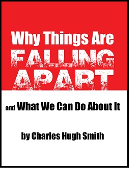
Things are falling apart--that is obvious. But why are they falling apart? The reasons are complex and global. Our economy and society have structural problems that cannot be solved by adding debt to debt. We are becoming poorer, not just from financial over-reach, but from fundamental forces that are not easy to identify. We will cover the five core reasons why things are falling apart:
 1. Debt and financialization
2. Crony capitalism
3. Diminishing returns
4. Centralization
5. Technological, financial and demographic changes in our economy
Complex systems weakened by diminishing returns collapse under their own weight and are replaced by systems that are simpler, faster and affordable. If we cling to the old ways, our system will disintegrate. If we want sustainable prosperity rather than collapse, we must embrace a new model that is Decentralized, Adaptive, Transparent and Accountable (DATA).
We are not powerless. Once we accept responsibility, we become powerful.
Kindle: $9.95 print: $24


